ucsd extension program - ux design certificationhinge (concept)
An improvement on the existing experience to allow users to be able to create meaningful connections with ease
Discovery | Ideation | Wireframing | Prototyping | Iteration | Usability testing
Role: Lead UX Designer
Tools: Figma, SurveyMonkey
When: Fall 2019
Medium: Native mobile app
Project details
Hinge is a dating app that was created back in 2012 and has gained popularity amidst various dating apps today.
The app underwent a major redesign in 2016 to showcase more sophistication to allow, for example, profiles with personalities. The goal of the redesign was to better its experience for more intentional dating vs. casual hangouts.
Today, with it’s new ad campaign “Design to Be Deleted,” Hinge is aiming to help users find a partner who is worth deleting the app for.
product
Although Hinge is a popular dating app, through research it was discovered that most users only sometimes use it. 3 main problems were discovered: the hierarchy of content on each candidate’s profile, the lack of a profile verification system/feature and the location of the “Like” and “Dislike” CTA.
How might we Reinvent the experience to allow users to create more meaningful and trusting connections and relationships?
Problem
User research was conducted to understand pain points and user needs.
1 Survey - 20 responses, 3 Foundational Interviews
Research insights and design solutions
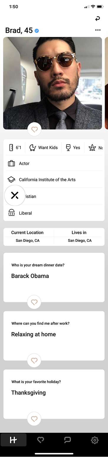
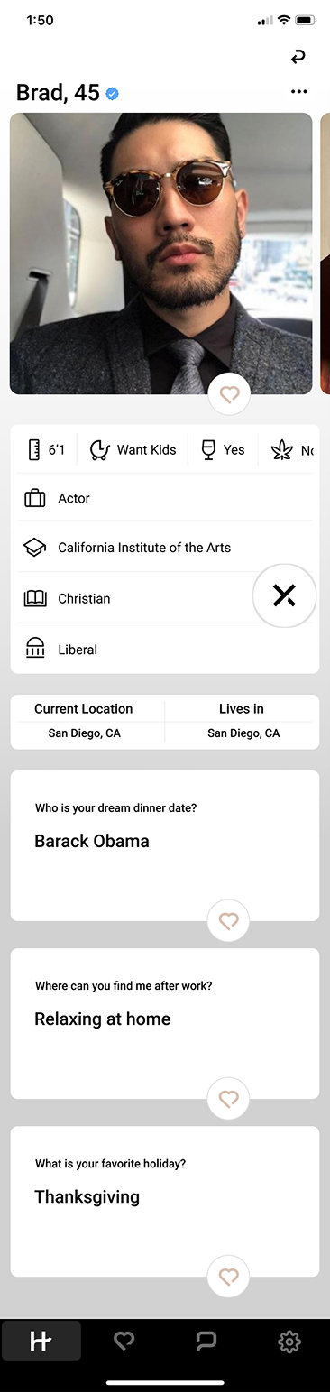
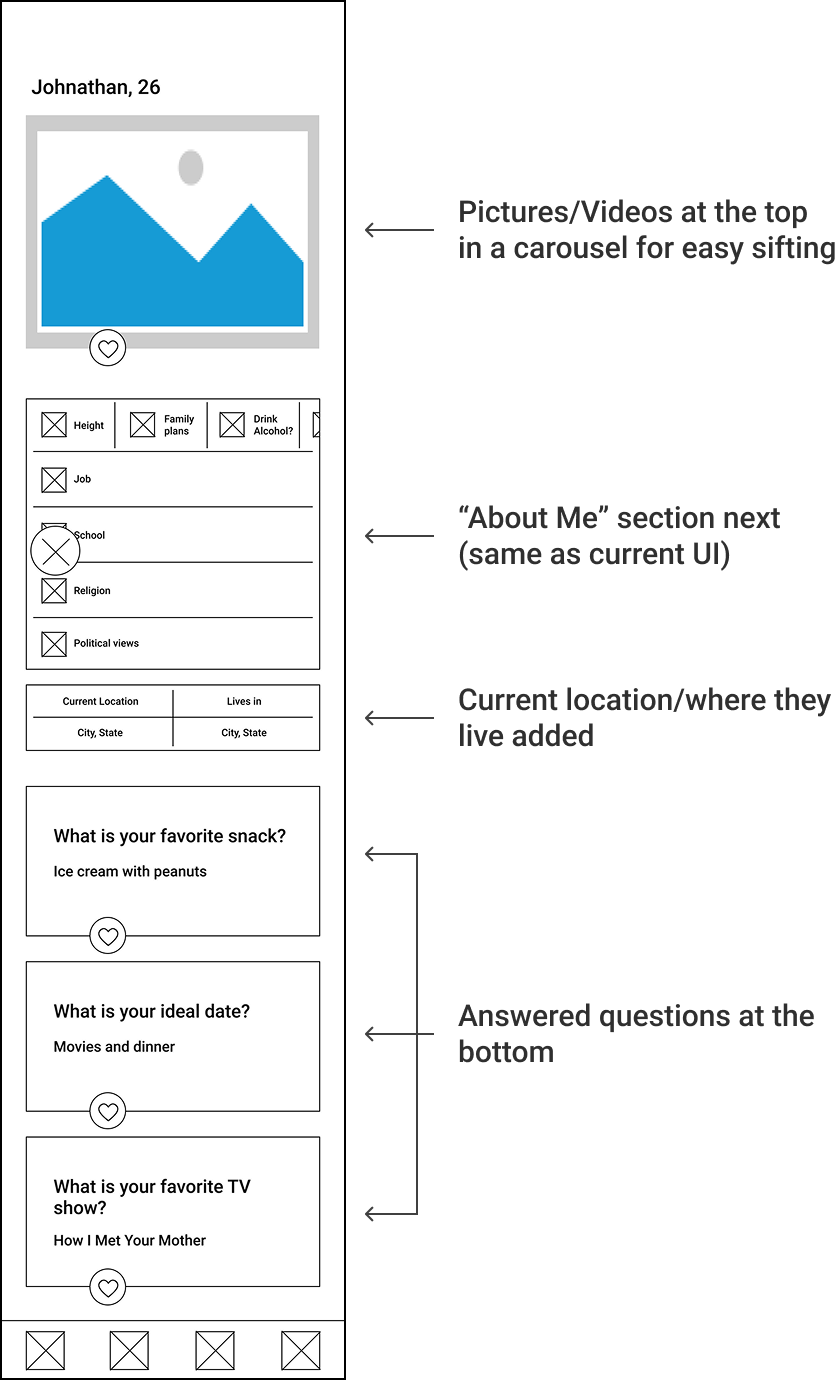
Problem 1: Hierarchy of content on candidate’s profile
45% of survey respondents selected pictures/videos to be their most important piece of information. The “About Me” section came second with 35% of the votes and answered questions got a low 20%.
“Immediately I like how you can see the details about them...” (user talking about Bumble, a competing dating app)
Design solution (reorder content)
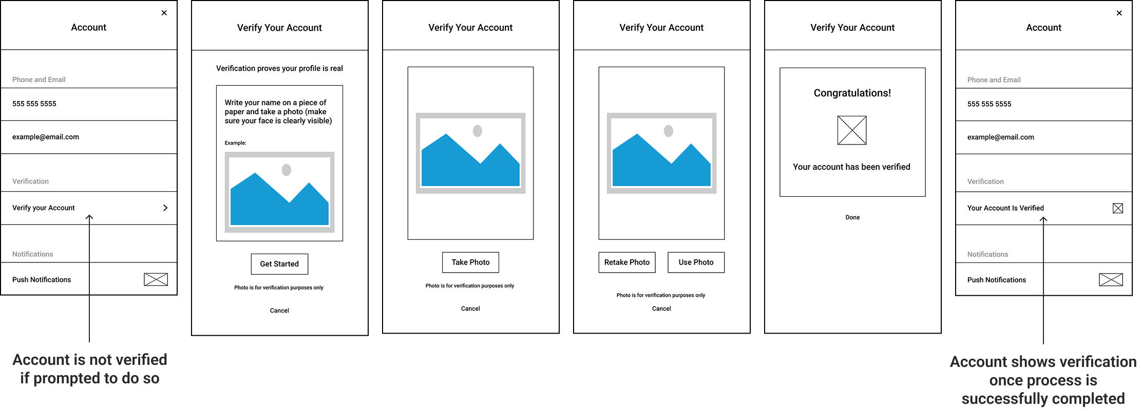
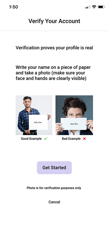
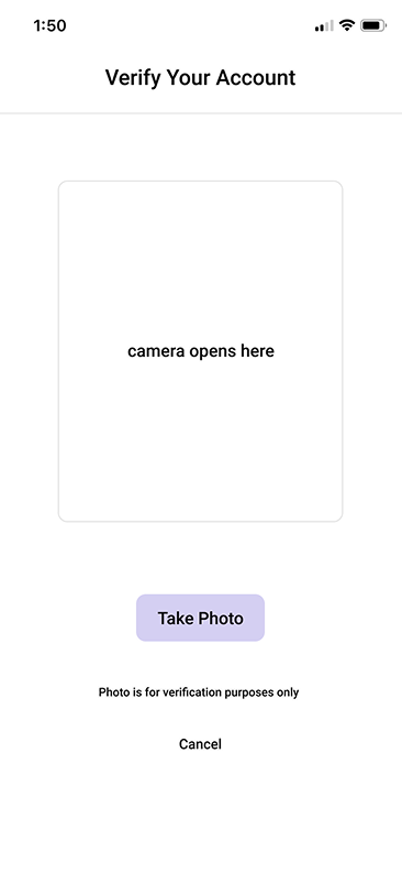
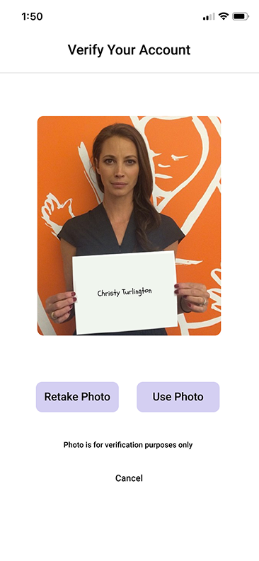
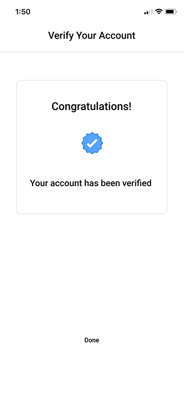
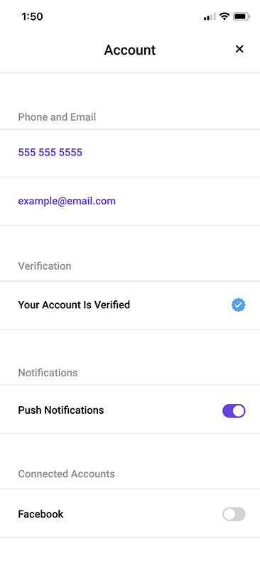
Problem 2: Lack of profile verification system/feature
85% of survey respondents stated that it is indeed important to know if a potential match is real and not fake.
“...I don’t want to talk to someone and then them not be who they say they are, that’s why I never go on dating apps, it’s my biggest fear.”
Design solution (create verification feature)
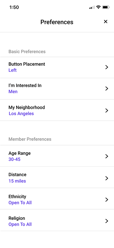
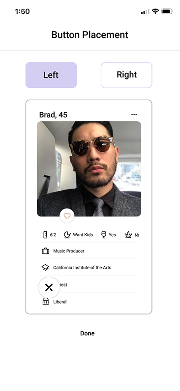
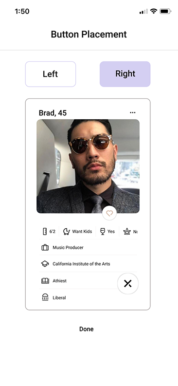
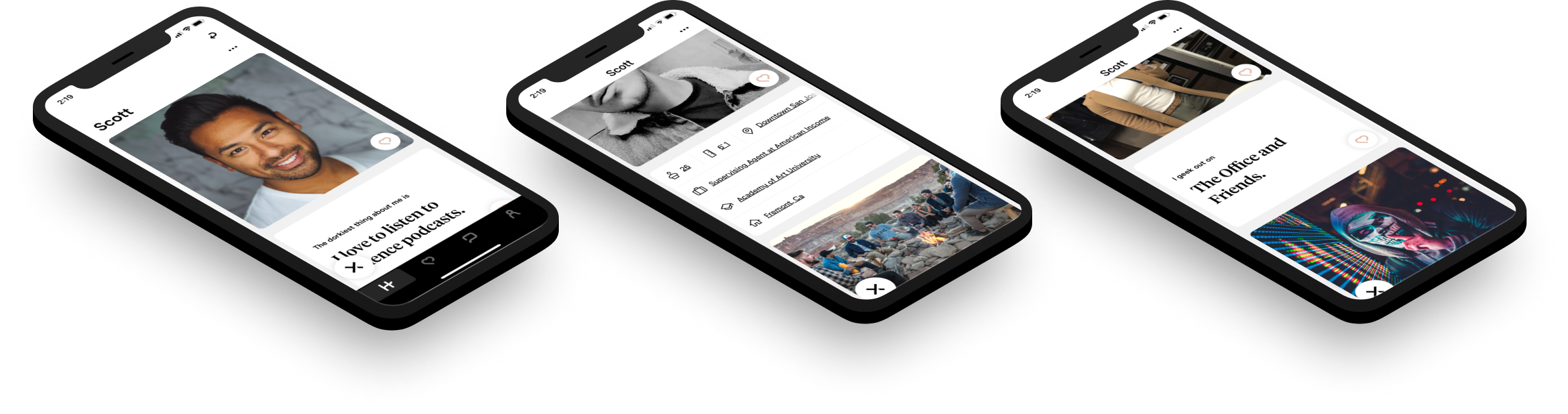
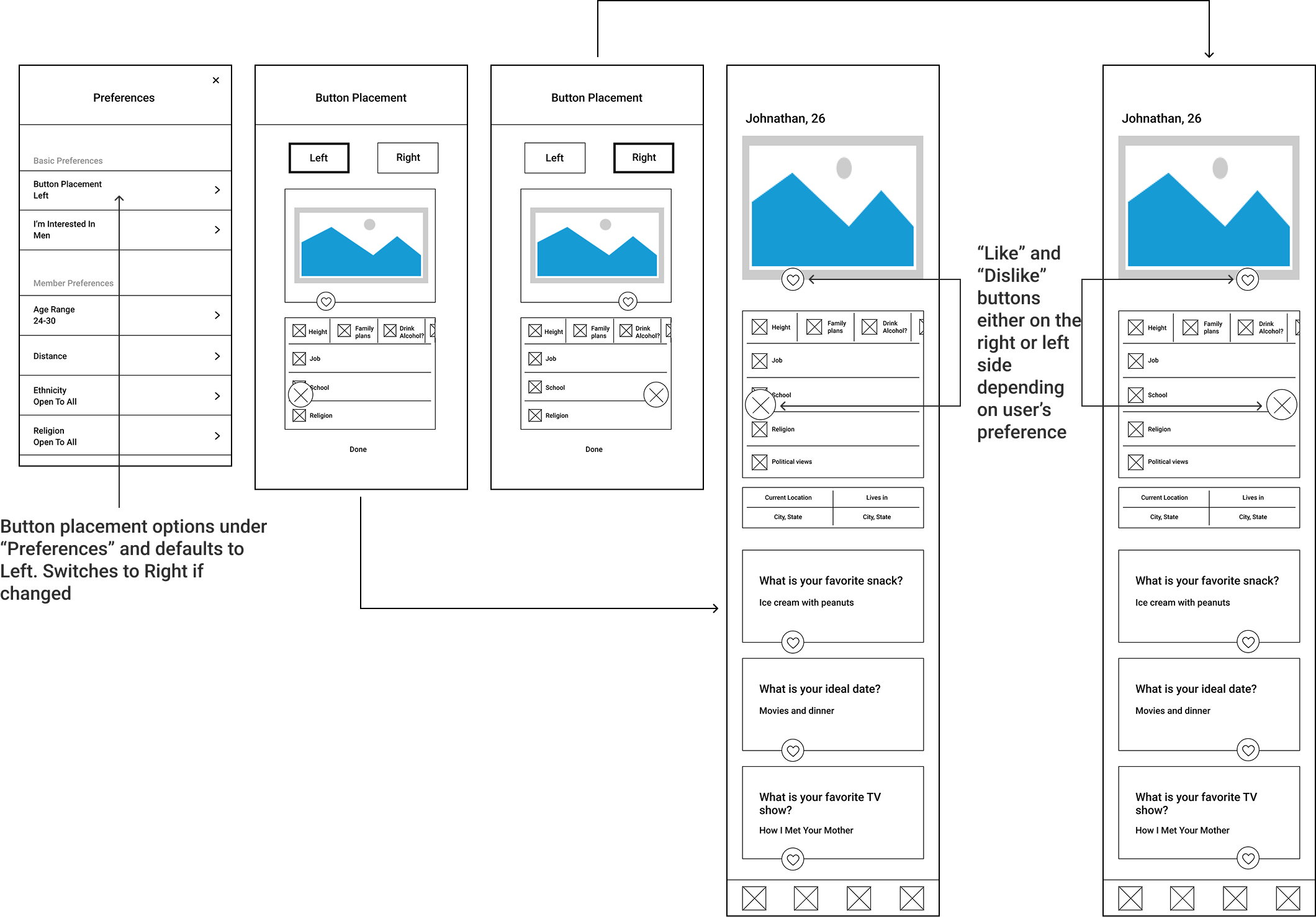
Problem 3: Location of buttons
90% of survey respondents use Hinge while lying in bed in the morning/nighttime. It is assumed that, therefore, they will be holding their phone in 1 hand.
“...having those little buttons on the left and right is not exactly a good experience... your thumb has to go all the way to the left...I didn’t like picking up my thumb and going that far.” (A right handed user)
Design solution (create a feature to allow users to choose the location of the buttons)
Final designs
Verification feature
Button location feature + profile content hierarchy