Best Buy | Sale Event Reimagined
A complete redesign of Best Buy’s sale event page allowing users to easily discover and shop for deals during high traffic and high stakes times.
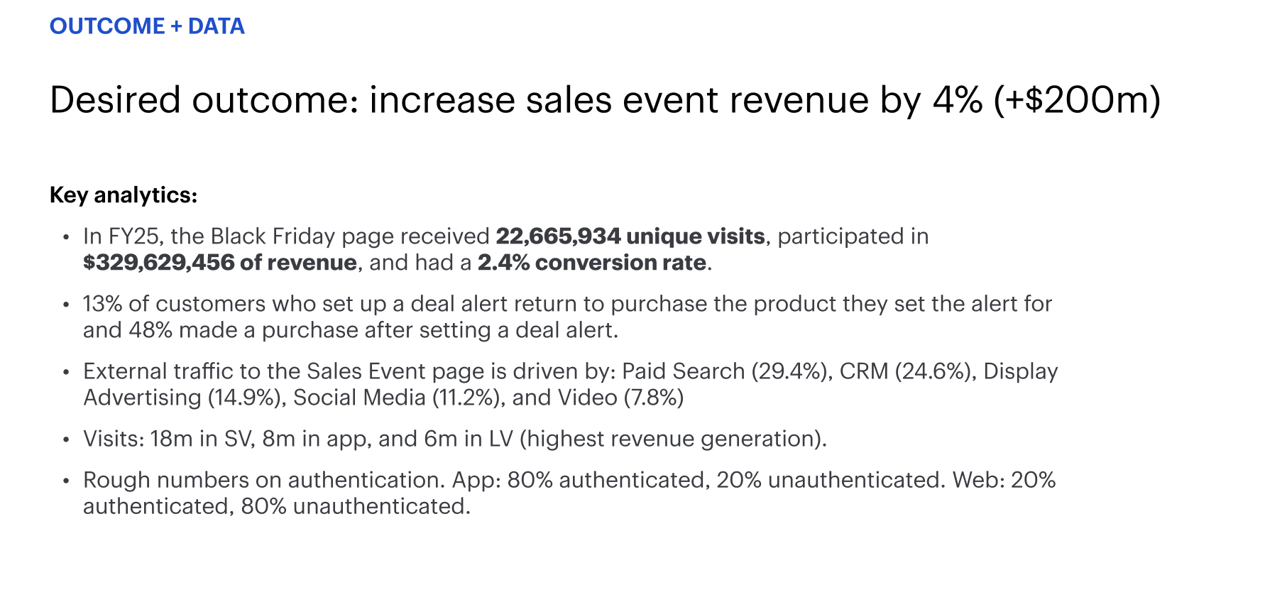
Conversion lift
App engagement
+14 bps
Conversion lift
+31 bps
App engm.
+18%
Module eng.
Module engagement
Project overview
Best Buy's sale event pages are some of the highest-traffic moments in the business, think Black Friday, Cyber Monday, and seasonal clearance events where millions of users land with high intent and low patience. The existing experience wasn't keeping up. Pages felt cluttered and deals were hard to scan. There was no proper information architecture or flow to the page.
The goal was simple: make it easier for someone to find what they want and buy it before the deal disappears. The redesign introduced a clearer visual hierarchy, modular storytelling, and more adaptive layouts. Customers located relevant deals faster, merchandising gained more flexibility, and the experience performed better across both mobile and desktop.
Project details
My Role | Senior UX Designer
Tools Used | Figma, Miro, Jira, UserZoom, Generative AI
Collaboration | Design, Product Management, Development, UX Researchers, Digital Content, Branding, Ads
Medium | Desktop Browser (large view + small view), Native mobile app
Problem
During high-traffic sale events, Best Buy customers struggled to quickly find and act on relevant deals, resulting in missed purchase opportunities and lost revenue. The existing sale event pages were visually overwhelming, lacked clear hierarchy, and created unnecessary friction in the path to purchase at the moments when user intent and business stakes were at their highest.
How might we help shoppers quickly find and act on the deals most relevant to them during high-pressure sale events?
Requirements
PRODUCT GOAL
Increase engagement and conversion on sale event pages by making it faster and easier for high-intent shoppers to find, evaluate, and purchase deals before they expire.
OBJECTIVES
Easy to navigate | Create clear IA so users can shop and scan the page easily
Trustworthy | Give users confidence that the deals they see are real, current, and worth acting on quickly
Dynamic | Enable machine learning to surface the best deals in real time
Desirable | Showcase the best sales at the forefront so users can make quick decisions
DESIGN GOALS
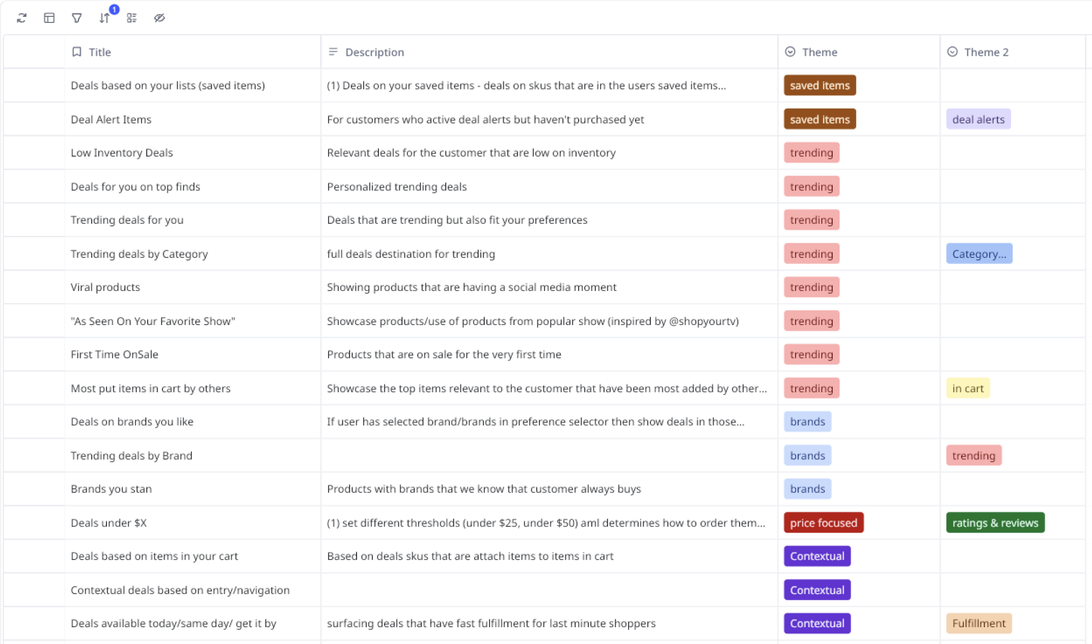
Story based | Create stories that showcased buckets of deals based on different themes
Templated stories | Construct templates to easily plug in new themes and deals based on the specific sale event
Incorporate Ads | Collaborate with the Ads team to incorporate ads in a meaningful way with intent
Collaboration
VPs | Maintained close, ongoing alignment with the VP of Design and Product throughout this high-priority project to ensure design decisions stayed connected to business and product strategy.
Product | Understood product requirements, discussed new or changing requirements, intentionally highlighted key requirements during design reviews, regular review sessions for feedback and direction
Development | Understood timelines and shared goals of high quality, feasible products, worked out technical concerns during design reviews, continuously communicated after handoff to answer questions and ensure visual QA.
Digital Content | Thoughtfully integrated managed content, ensuring brand promotions felt native to the shopping experience without disrupting the path of discovery and purchase.
Brand | Adhered to the appropriate branding guidelines that had been specifically designed for each sale event
Ads | Collaborated to place promotional content intentionally, ensuring it complemented the shopping experience rather than competing with it
Solution
The redesign moved from disjointed modules, outdated UI, unclear hierarchy, and heavy scroll fatigue to stronger storytelling, cleaner components, a simplified event structure, clearer price and value cues, and more opportunity for personalization and dynamism.
+14 bps
Conversion lift
+31 bps
App engagement
+18%
Module engagement
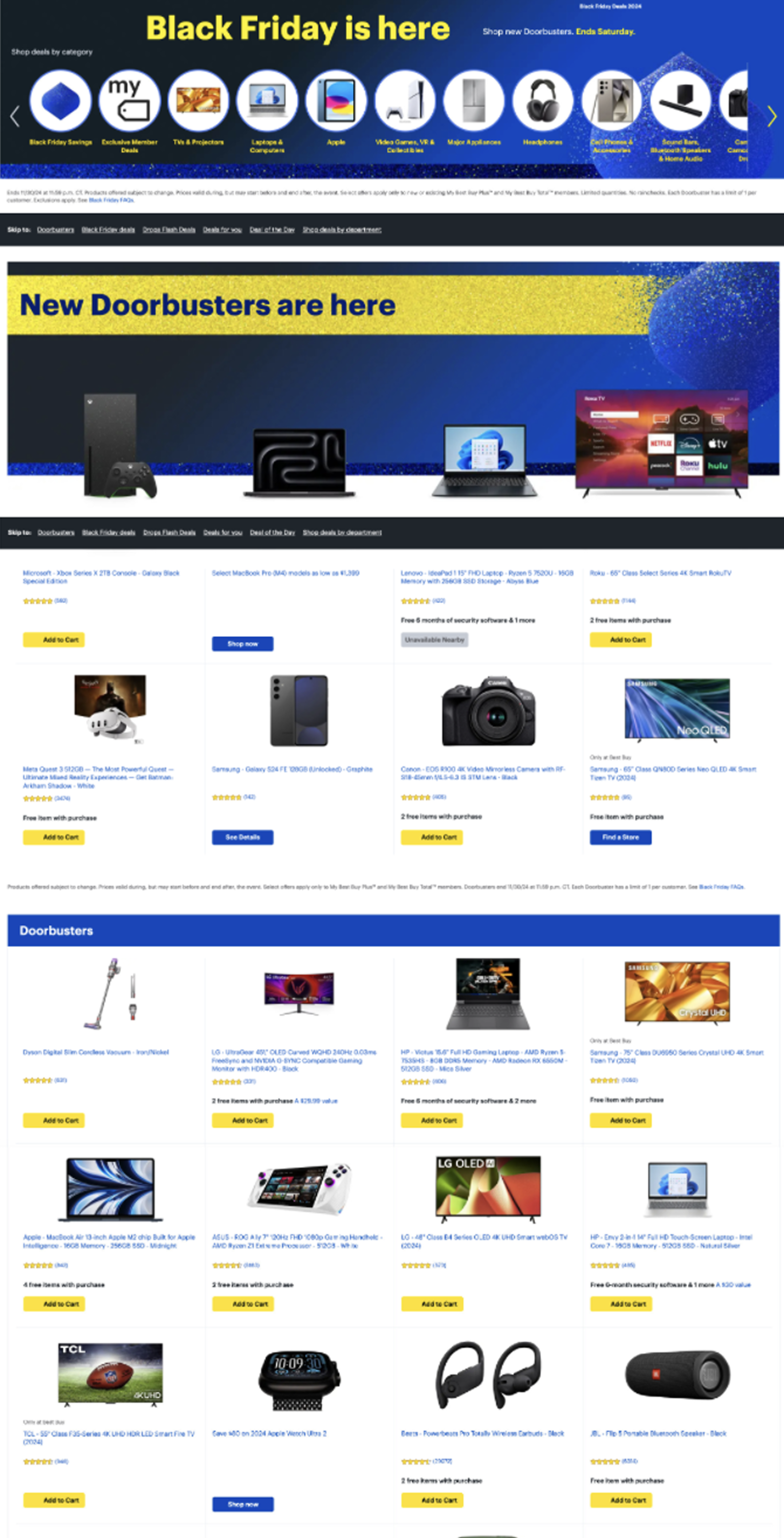
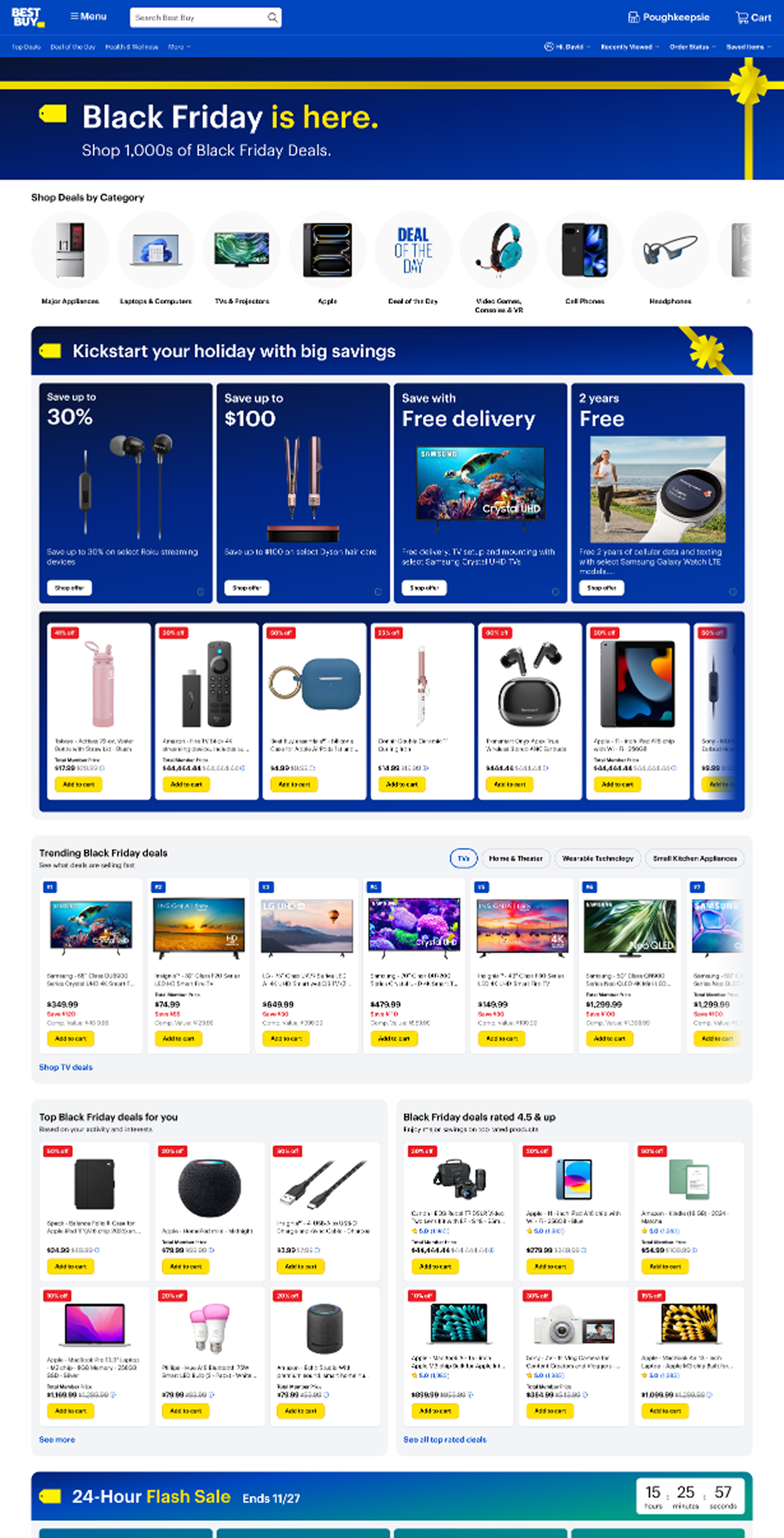
Before
After
Discovery
Reviewed analytics, explored historical event performance, and worked with our product partners, Digital Content Team (DCT), and Standards team to understand pain points. Identified where users dropped off, what modules under-performed, and what content teams needed to highlight. Discovery phase helped to kickstart the design phase.
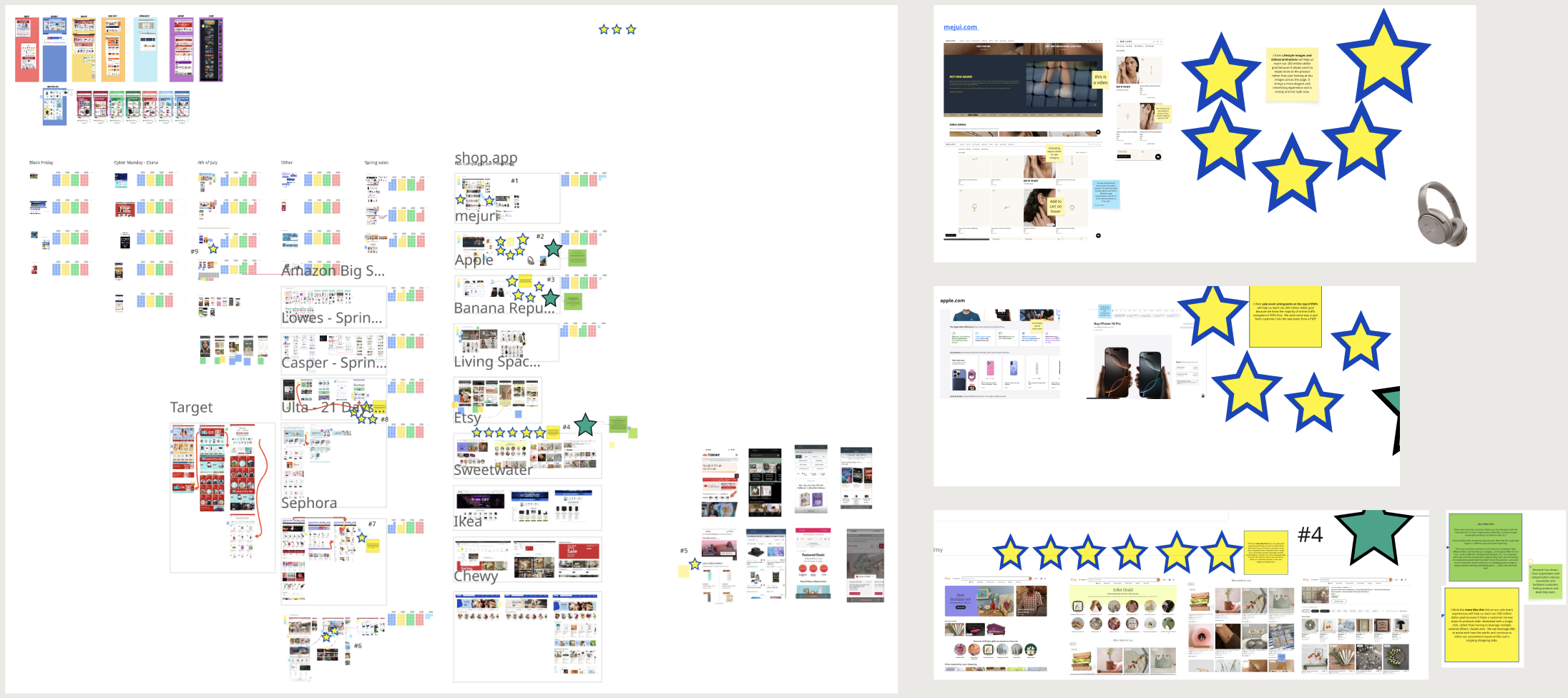
COMPETITIVE ANALYSIS
We did a TON to understand what competitors were doing and what was working
PAST ANALYTICS
Learned how the current experience was performing
PAST RESEARCH
Brushing up on what has already been tested and learned
Foundation exploration
From here we worked on overall page layout and IA. Subsequently, Product and Design workshopped story themes and ideas to determine how to best group deals on the page. We ideated across a spectrum, anywhere from simple ideas to blue sky, out of the box ideas.
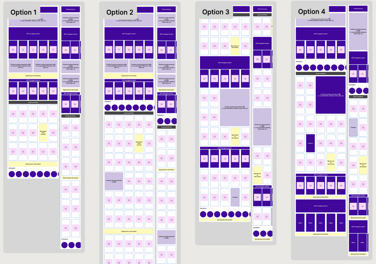
INFORMATION ARCHITECTURE IDEATING
INFORMATION ARCHITECTURE PROPOSALS
STORY THEMES WORKSHOP
Design Exploration
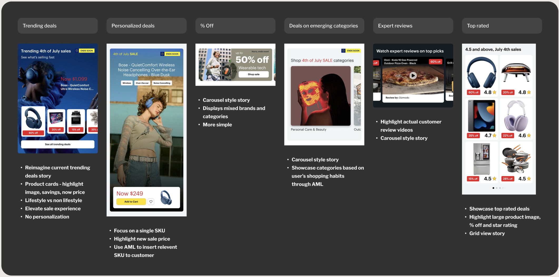
From here we worked on ideas for each story. We wanted to explore lifestyle imagery, a direction our competitors were leaning into heavily.
Research | round 1
We ended up doing a round of quick research to determine if we were going in the right direction. We sent out a survey to 50 people where we asked about IA, imagery, and more.
KEY FINDINGS
Lifestyle Imagery vs Product Images | When it came to Best Buy products, users preferred product images
Category Carousel On Top | Majority of users expressed their opinion on the value of the category bubbles
Organization | Users appreciated when pages felt organized in the way they present their products
Theming | Users appreciated when products were grouped into clear themes.
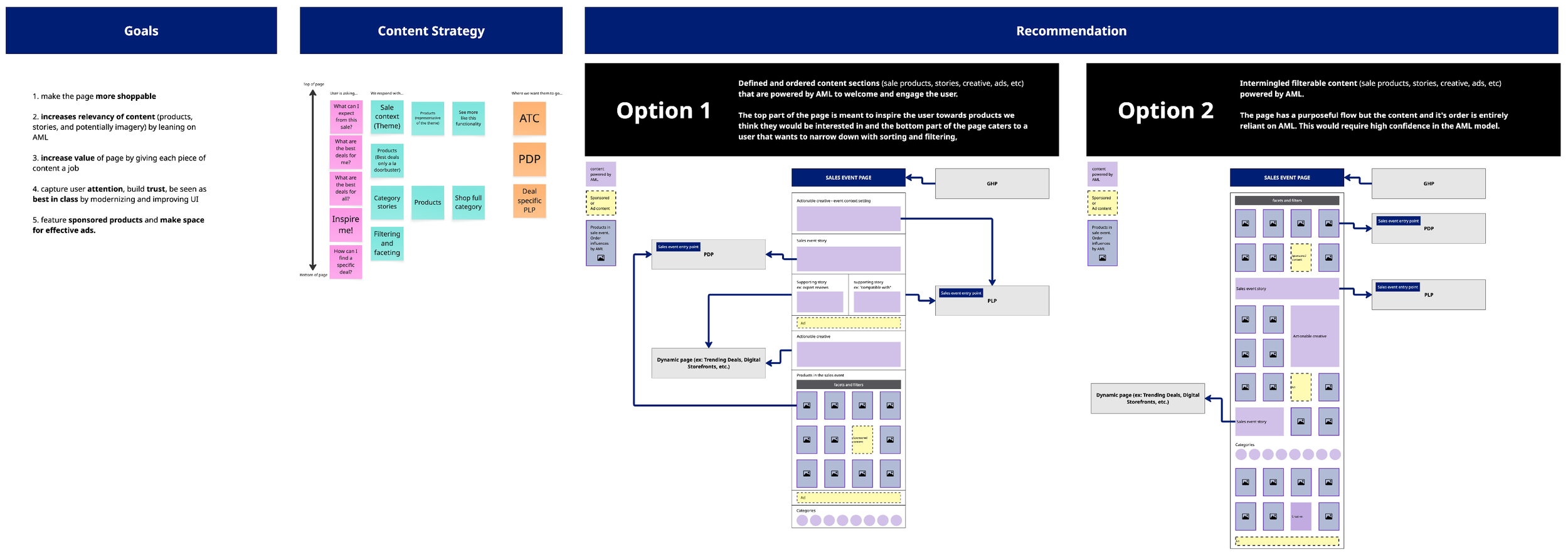
Iteration
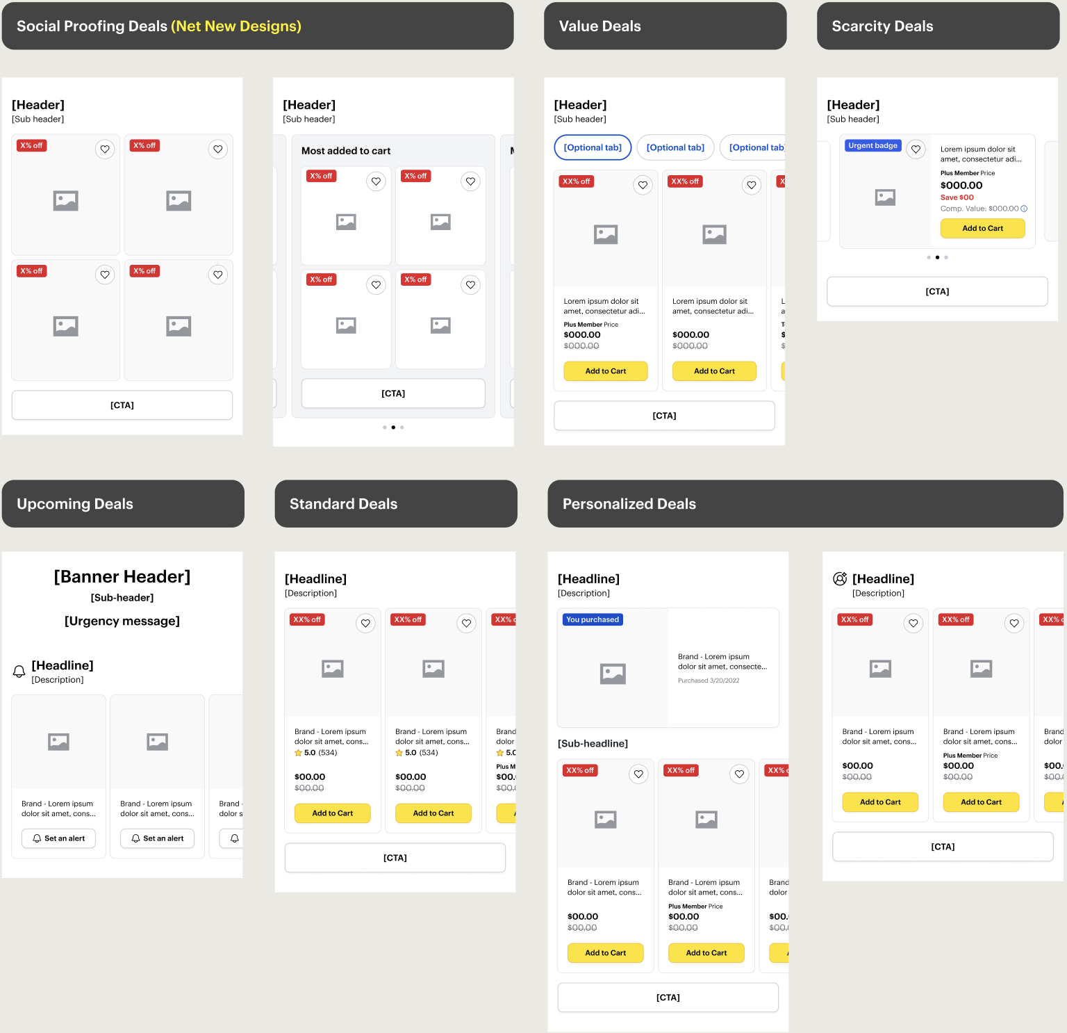
We shared our research with our stakeholders and based on findings, we all aligned on going in a slightly different direction. As a team, we decided on the following themed templates: Value Deals, Standard Deals, Personalized Deals, Social Proofing Deals, Scarcity Deals and Upcoming Deals.
We decided to templatize the story themes, making the page more dynamic by enabling AML to slot deals into the appropriate sections based on each user's behaviors and activity.
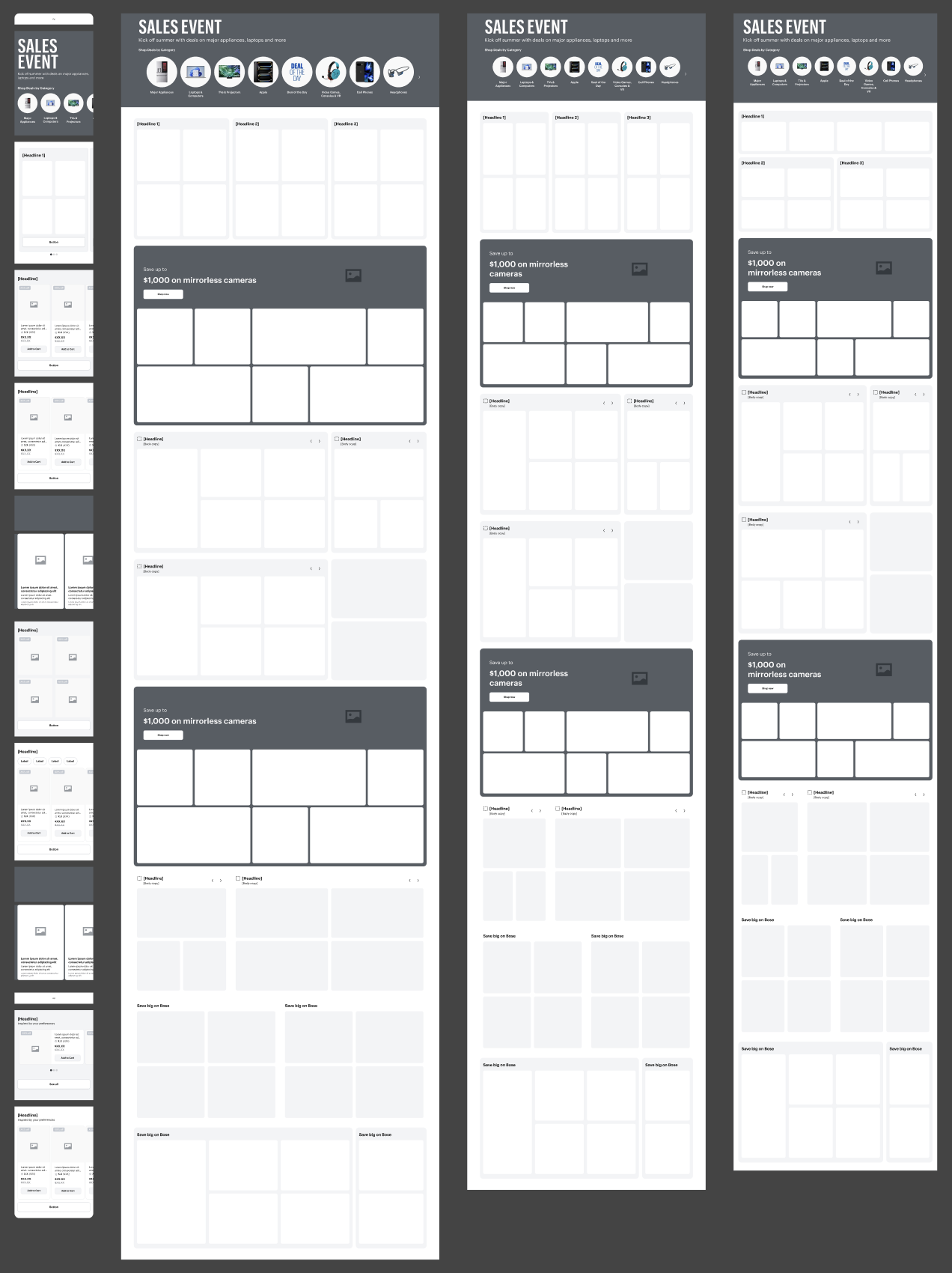
Scalability
We started with mobile, but had reached a point where we needed to consider how the experience would scale to larger viewports. We started wireframing for most popular viewport sizes.
Research | round 2
Our research partners conducted moderated interviews with 7 participants, testing our new high-fidelity full-page mockup against the older version to evaluate how the two compared.
KEY FINDINGS
Organization and Readability | Users were able to scan the page quickly and see the different deals in a clear way. They mentioned the previous experience had no rhyme or reason for the layout of the deals, which made it hard to discover and understand deals.
Category Carousel On Top | Majority of users agreed the placement of the category bubbles at the top was most appropriate. They liked the visual design of the new category bubbles vs the old ones.
Too Much Urgency | Having timers for deals on a page for a timed sale event created too much pressure for the user to shop. [Recommendation: remove ‘Scarcity Deals’ template]
Final designs
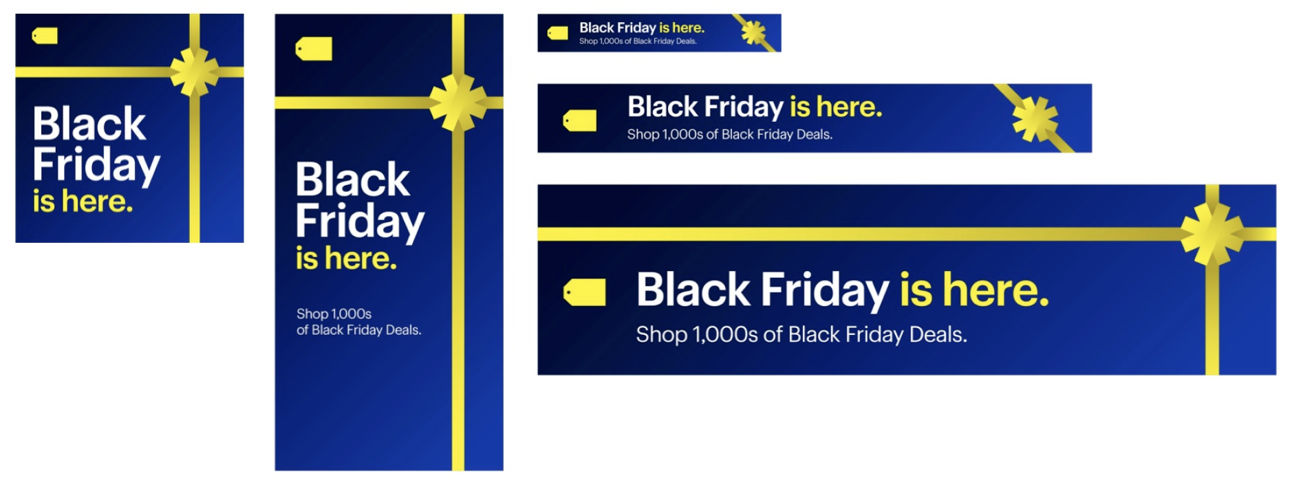
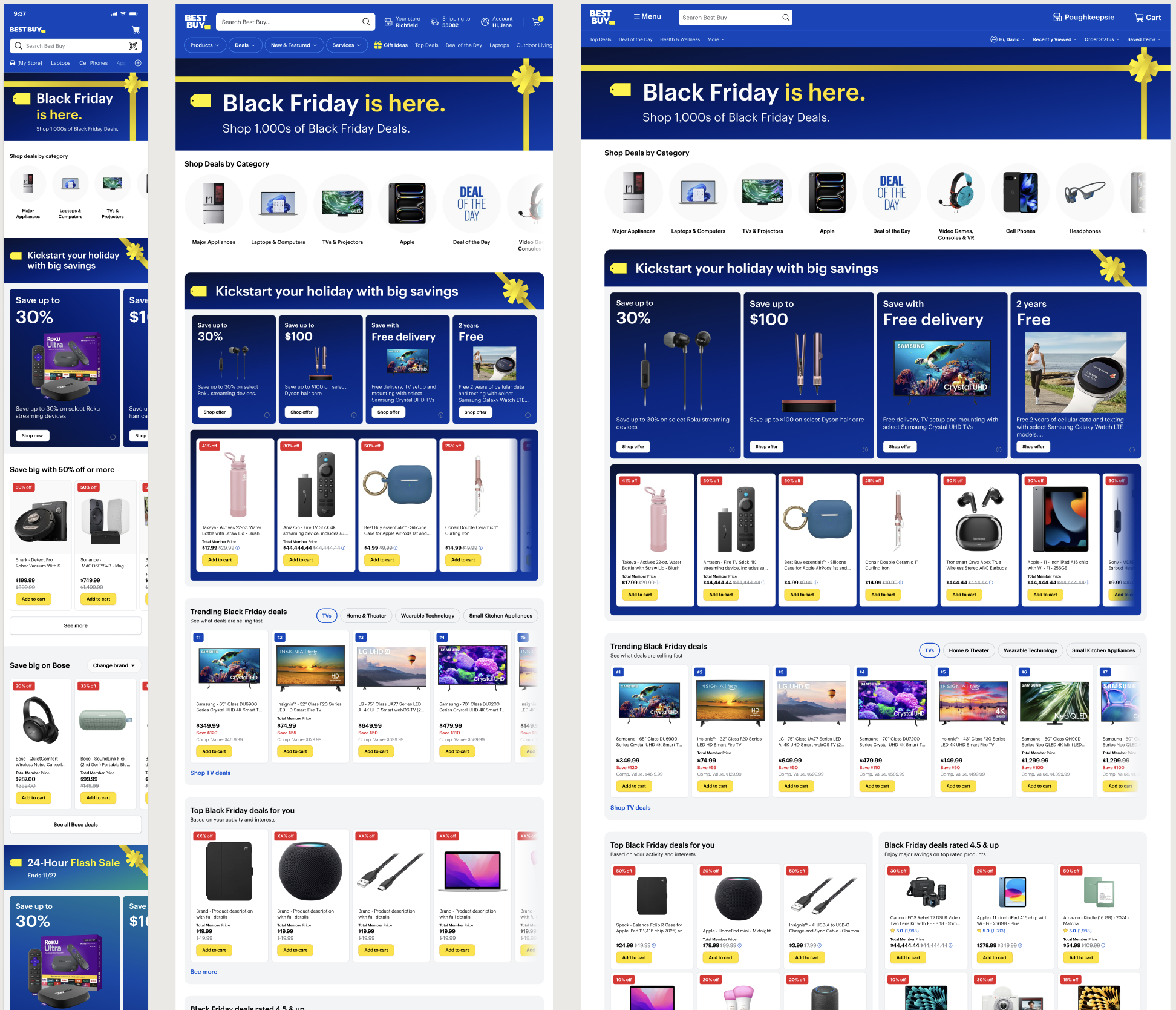
Brand had finalized the promo style guide for our target sale event: Black Friday. We used these designs to create high fidelity wireframes to showcase our final designs.
Handoff
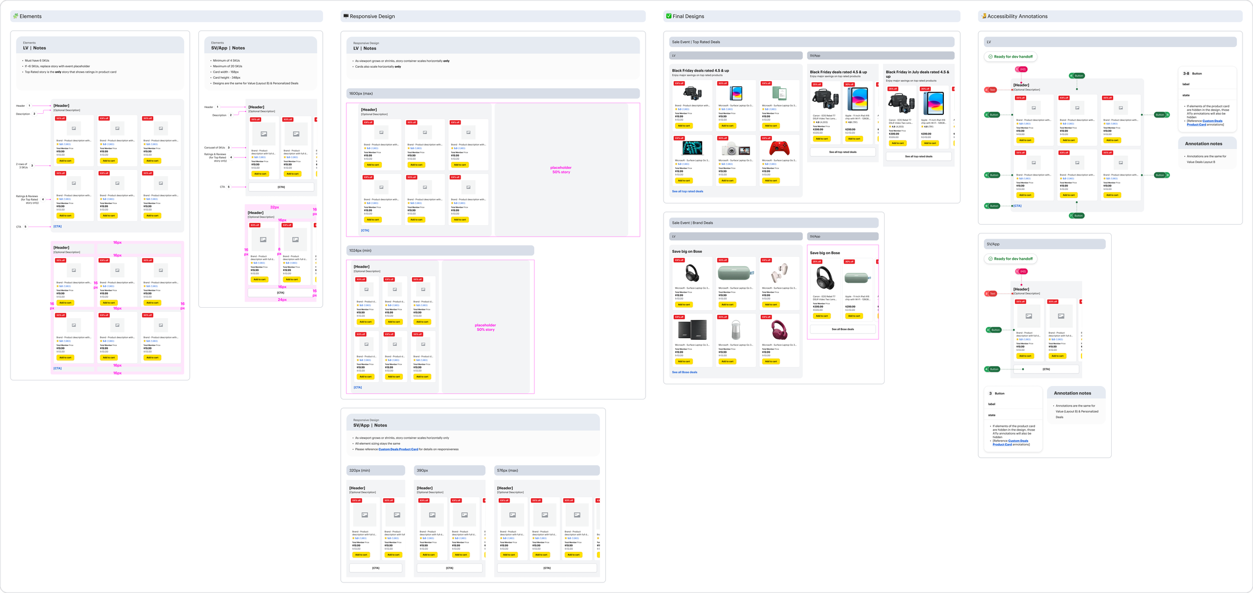
I created the handoff page that clearly displayed each template with notes, the padding, the responsiveness, the final designs for each story and the accessibility annotations.
Metrics
+14 bps
Conversion lift
+31 bps
App engagement
+18%
Module interaction
Reflection
This project was one of the more rewarding and challenging experiences of my career. As a high-priority initiative, it naturally attracted significant input from leadership, which led to frequent pivots throughout the design process. Several features we had invested considerable time in were ultimately cut, and the initial directive to think boldly and push creative boundaries eventually gave way to a need for simplicity and restraint. While that shift was at times difficult to navigate, it reinforced an important lesson: designing within ambiguity and evolving constraints is an unavoidable part of the process. It pushed me to stay adaptable, advocate for design decisions with intention, and find impact within tighter boundaries.